KIKI Case Study: Digital Product design. UX/UI
Product: KIKI / Client: Kiki Corp./ Year: 2019
Role: User experience and interface design
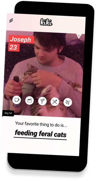
On KIKI app people are gonna be paying to go out on a date with you. Will they? I don’t know, that’s not my problem: I’ve only designed the UX/UI. But the app it’s already been released in Spain, the US and Mexico. And the company got founding and moved to Silicon Valley. Good for them!

Shadyness & controversy
Before starting to work with KIKI I made sure it was not only women offering themselves for dates but also other genders. That was important to me beacuse I'd never work for a company that doesn't match my ethics. After that point was clear I was excited to be part of such a challenging project.
The Problem: Bugs and dead ends
Bug reports, mad users leaving bad reviews and a poor graphic design made the whole experience not friendly and didn’t help at all to an idea that is a bit ambiguous to start with. Analytics and user reviews revealed customers struggled, and sometimes abandoned, or didn’t understand the steps needed to finish their journey. To understand why, we conducted usability tests and analyzed the reviews.
Since there was no budget for user research I decided to conduct my own little study making my friends from the coworking space where I was working at that time use the app. 3 tests were run. I made notations of their impressions, their struggles and watched how they whent trought the app, where they got stuck and so on.
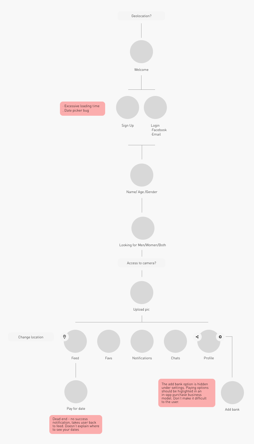
It started with a clucky on boarding process, follow by the struggle finding how to connect a payment method. And second and even more important: it wasn't clear how to proceed after you "purchased" a date. "I don't think that is working", "I wouldn't connect my bank account to it" or "Is this real?" were some of the comments.
Process: From shady to trustworthy
Our high level goals were to:
Make it fast and easy to use / Take users easily trough the app so they can finish their journey and enjoy it / Adapt the visual language to make it more trustable and trendy.
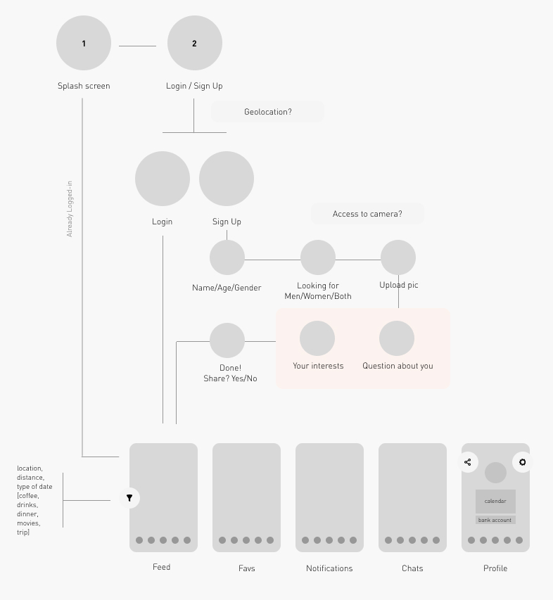
I had to change the flow from scracth and add must-have steps to the game.
So we went from this:

To this:

The Prototype
After defining the user flow I created a first prototype in Figma. You can take a peak if you wish.
The conclusion
It’s not only about the idea, what will make the difference is how well you achieve to explain it, to put it out there. Everyone on the team were very happy about the new toy they got in their hands. After a few months they contected again but due overload of work I couldn't continue working with them. I enjoyed the experience very much and I hope the best adventures in The Valley to these crazy kids.